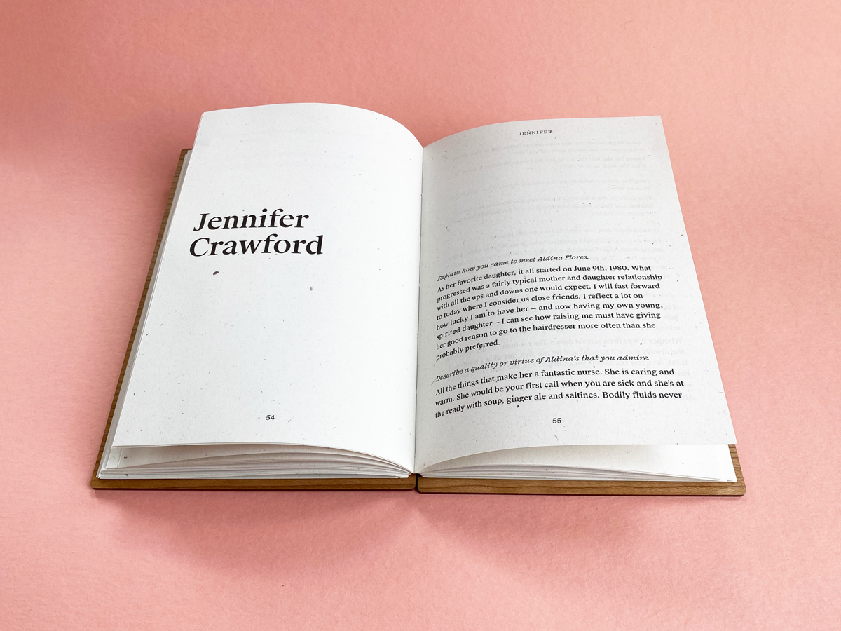
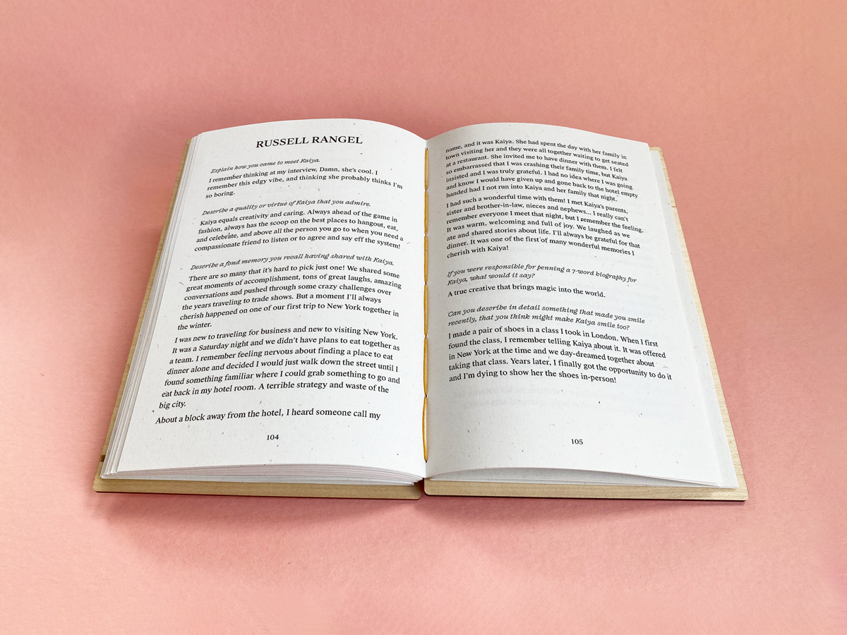
What does a printed contribution look like in the book?
Depending on how many contributions you collect, we’ll use one of two layouts. Books that have less than 50 contributions will use a layout with more whitespace, while those with 50 or more contributions will use a more condensed layout. This allows us to charge the same price no matter how many contributions you collect. In both layouts each contribution occupies a spread or more, if needed. We use a combination of Suisse Works and Fragen fonts.
In the contribution form we suggest a maximum of 1800 characters, for consistency, but the form will accept more or less.
Here are examples of each layout:
 For books with less than 50 contributions, we use a layout with more whitespace
 For books with 50 or more contributions, we use a more condensed layout
Questions? We’re here to help.
Visit support or Give us feedback
We value your words.
Updates, gifting tips, and promos
— an occasional newsletter